AIN CARD VIEWS
THE PROBLEM

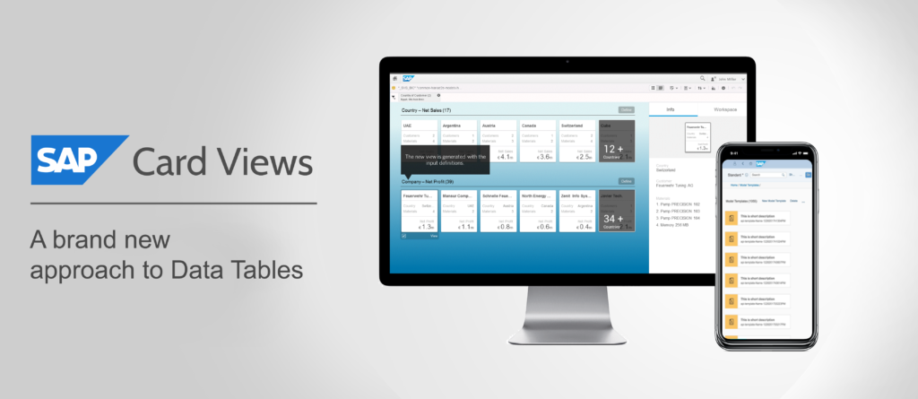
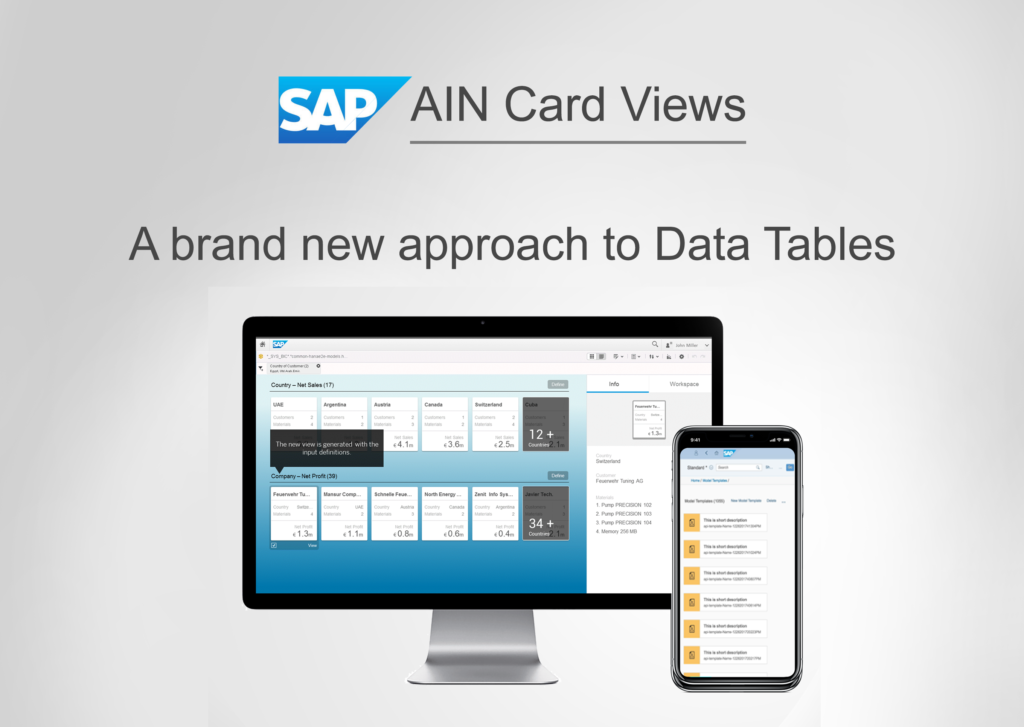
Many of our customers who were using the Asset Intelligence Network Suite of Applications, often responded saying they found our Data tables too “Boring” and/or difficult to be consumed by anyone other than a power user. As designers, we found the Large data tables to be cumbersome to be made responsive using the existing Fiori Templates (SAP’s proprietary design language).
A few of us banded together and started collating use cases for a card view layer control that can be applied over all the tables across SAP’s offerings, without taking away any of the functionality.
SOLUTION
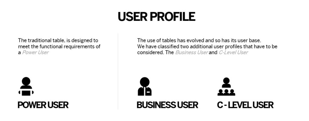
We classified the users of Data Tables across SAP Products into 3 Broad Classifications. The existing tables catered to the Power User or the Data Ninja. We aimed to solve the pain points of the remaining 2 Users to consume complex Data Tables.
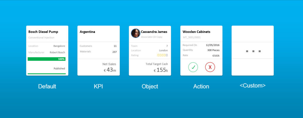
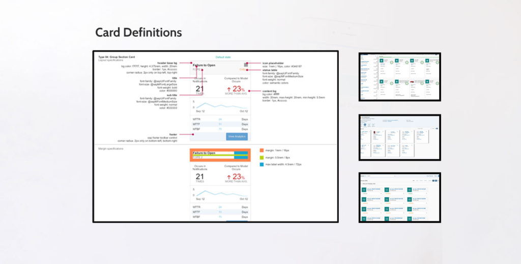
Through interactions with various product owners, we identified 4 broad classifications of table / data formats and designed Cards and Use Cases for each of them.
DATA ABSTRACTION, AGGREGATION AND COMPARISON
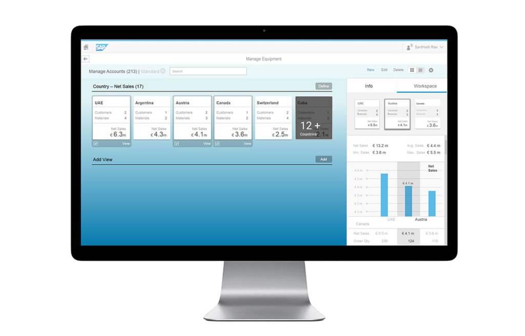
In Data heavy usecases, aggegated Data would be shown on cards so that the User can get insightful data, before drilling down to specific details.
On Multple selection of the cards, a comparison view is presented with basic math functionality such as Sum, Difference, Counts of the Data items shown. These functions can be customized as well.
AWARDS
We entered the concpt for the Bernd Leukert’s Innovation awards. From over 200 Ides submitted, we were among the 3 selected as winners. We got to present the Idea at the TechED Las Vegas 2016, and got to go to Hawaii as a part of the Winners Circle
IMPLEMENTATION
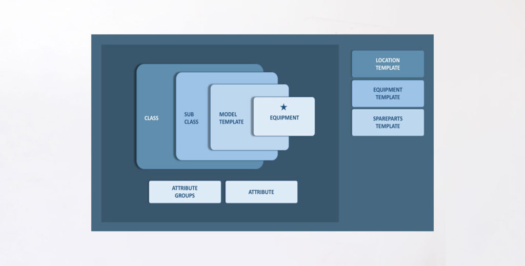
We identified a list/table heavy application from the AIN Suite and decided to implement the card views. The application selected was the Template Explorer where N-Level Nested information has to be displayed along with quick views and easy navigation.
There were a large number of template types across every product in the AIN suite. Hence, the home screen was an aggregation view providing a quick summary of the Templates landscape. If the user is looking for a particular template, they can quick search and arrive at it.
IMPACT
RESPONSIVE
SCALABLE
