THE BETTER INDIA
WEBSITE REDESIGN - WORK IN PROGRESS
THE PROBLEM
TheBetterIndia.com is a news website that is focused on positive news from all over India. In an age where, the internet is plagued with negative news, propaganda and fake news, TBI (The Better India) found a niche to report all the good done be people and organizations across India. They have tied up with NGOs (Non Government Organizations ) and Charities providing them with a channel to drive change, as well as a repository of sustainable solutions for the future.
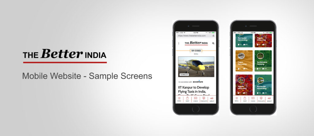
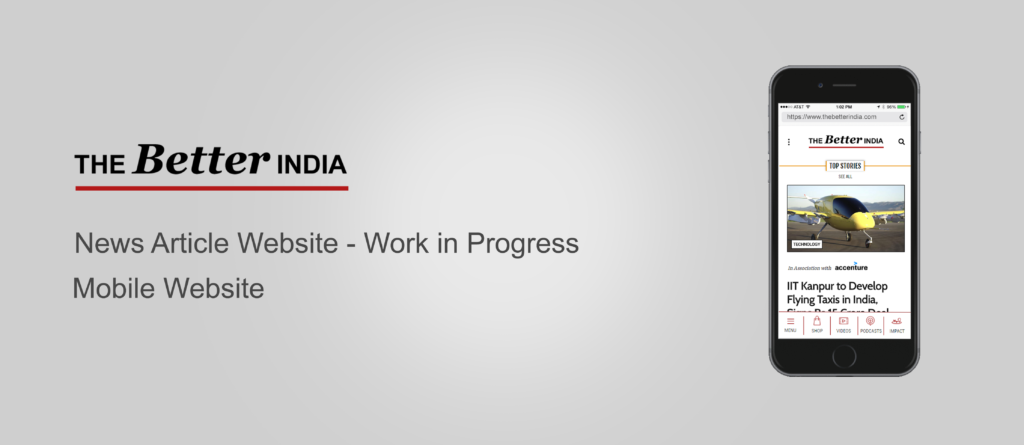
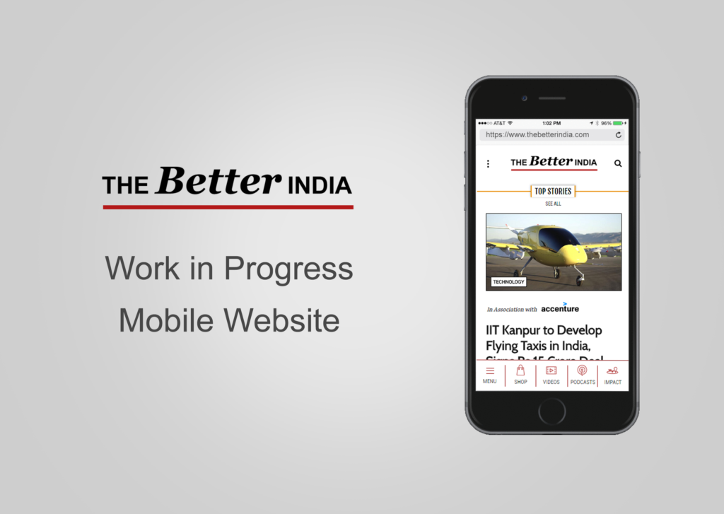
They wanted a mobile first approach for their website as they realized a large chunk of their traffic consumes their content on the mobile. They also wanted a more actionable customer interaction, to buy / promote Eco-friendly substitutes to reduce carbon footprint, as well to donate / volunteer for causes of their choice.
USERS
The average user consumes a large quantity of articles and listicle on a daily basis on their phones (on the go) or on their desktops (usually at work). They would generally arrive at an article page from Facebook, from a link shared by a page or a friend. This gave us an insight to treat every article page as a possible landing page.
User pain points were : Lack of trust in authenticity of the article, not being able to take action after reading an article, having to navigate between actual content and advertorials / promotions.
SAMPLE DESIGNS
